|



This website has gone through many changes since we began, evolving so much over these many years. Below you can take a trip back in time and see what it was like to visit this site in previous years. For those who've been around since we began, this might be a trip down memory lane for you, I know it is for me!
We have had 6 different layouts, one of which was changed slightly 2 times so over 10 years there have been a total of 8 layouts (almost 1 layout a year!). There are also a few layouts that I created but never used, you will see those below as well (though they are not interactive).
Each main layout will open up in a new window. All of the content has been left intact from when the layout was last used (so you really will be going back into the past!). You can browse the home page, the season 7 episode guide page and the Letting Go script. All other links have been disabled or will go nowhere.
Hope you all enjoy!
- Aurora

9/18/01 - 3/6/03
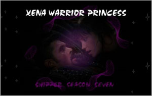
I'm really not sure where the idea came to create a layout with a black background and stars with purple as the main color.... But this is very near to our first layout ever. It's very simple with not a lot of complex design. I can't take full credit for it as it was mainly Dixie who designed it.

3/6/03 - 12/31/04

At this point, the layout became more "Xena and Ares". (i.e.--I wanted to use colors that were actually going to be something that would work for XA: black and red.) I also wanted the focus to be on the image of Xena and Ares that was cut from Motherhood because since we never saw it on TV, it really could be an image directly from the Shipper Seasons. It's too bad I didn't use this particular image more because it really could be THE Shipper Seasons image.

12/31/04 - 6/13/05

This layout I like to call the one I did for my web design class in college. I basically used this layout for a design I had done in college, only with different content. Then I took the same layout and made it for the Shipper Seasons. It's an okay layout (I consider it more of an experiment than anything) and I still like the previous black and red layout better.

6/13/05 - 12/12/05
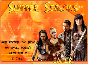
I love this layout. It is definitely the most time-consuming layout I had done thus far. I'm not even sure where I decided to make the colors so bright and dramatic but I just wanted something totally new and different, unlike anything before. The main header image at the top is my favorite, with Gabrielle, Eve, Xena and Ares featured. At the bottom of each page (on the bottom left) a different image of Xena, Gabrielle and Ares would appear so each page was slightly different. It was a lot of fun working on this layout!

12/12/05 - 2/12/06

This layout is basically an extension of the previous one. I really just wanted to make a layout that I could have up during Christmas time. I had fun making it cold looking to celebrate the holidays.

2/12/06 - 8/1/06
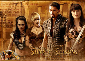
This is my favorite version of the layout. I love all the browns and the ancient feel it evokes. It's perfect.

8/1/06 - 7/7/07

I'm really not sure why I decided to stop using this layout; I think it's beautiful. I just love the intricate designs of Xena's armor and thought it lent itself to a very unique design. It didn't last as a layout of the SS as long as I think it perhaps should have but it's one of my favorites.
I haven't made any new layouts in a long time and I think I'm probably done making new ones, too (who knows, maybe in the future when the series is over there will be a new one). The one you see this website with now is the last one I did (4 years ago!). It's the most extensive layout to date because I wanted to make all of the different seasons have a different colored layout. I think it's worked out well.

Below are some designs that never made it online. Click on the thumbnail to view the larger image.
|


